Latest Issue:
Campus Politics–Palestine and the New University Order

Fighting the Campus Crackdown
Why the Middle East Studies Association Took the Trump Administration to Court
MERIP Updates
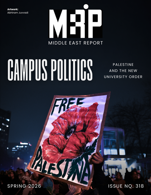
MER 318: Campus Politics–Palestine and the New University Order
Dear Friends and Comrades, Today, we published our spring 2026 issue of Middle East Report, “Campus Politics—Palestine and the New University Order.” Its publication comes on the second anniversary of the university encampments, the high point of campus mobilizations against the Gaza genocide that ignited faculty, student and laborThe MERIP Podcast Episode 21: Susann Kassem, Lara Deeb and Habib Battah
Today on the podcast three MERIP contributors discuss Lebanon’s tenuous, one-sided ceasefire with Israel. Even as officials in the Lebanese government have entered into negotiations with Israel, an unprecedented diplomatic move with questionable legal status under Lebanese law, Israel has violated the ceasefire numerous times and has continued its
NEW: Censorship and Surveillance at US Universities
Dear Friends and Comrades, Today we’re publishing the first piece from our forthcoming issue on campus activism and repression since October 7, 2023. In “Censorship and Surveillance at US Universities,” Torin Monahan details the expansive apparatus used by university administrations, often following federal or state political pressures, to police
NEW: ‘Our Compass is Broken’—Israel’s Ongoing War on South Lebanon
Dear Friends and Comrades, Amid the escalating US and Israeli war on Iran, the Israeli invasion of South Lebanon is intensifying. In addition to drone and missile attacks in Beirut, Israel is carrying out a combined ground and aerial campaign aimed at creating a so-called buffer zone up to the
Kicking Off Delco Gives 2026-Support Our Work!
Dear Friends and Comrades, Today marks the beginning of Delco Gives, a fundraising campaign sponsored by the Foundation for Delaware County in which MERIP is participating. While much of MERIP’s work is spread out over the country and the globe, we relocated our base of operations as a 501(The MERIP Podcast Episode 20: The MERIP Roundtable, On the Iran War Part III
Today’s episode is the third installment of our MERIP Roundtable discussing the war on Iran, instigated by the United States and Israel on February 28, 2026, and its regional reverberations. This episode focuses on Israel’s expanded war on Lebanon. Following the assassination of Ali Khamanei, supreme leader of
War Across Boundaries–Perspectives on Iran and a Region Under Siege
On February 28, 2026, the United States and Israel launched airstrikes on Iran, initiating a war with wide-ranging consequences for Iran and the broader region and devastating effects for their populations. Already, millions have been displaced and thousands killed. But this war is not a sudden rupture. It is theThe MERIP Podcast Episode 19: The MERIP Roundtable, On the Iran War Part II
On today’s episode of the MERIP Roundtable our discussion focused on people’s experiences of the war on Iran and throughout the region two and a half weeks in. Much of the discussion of this war in the western media has centered on the strategic calculus of the UnitedCurrent Analysis

Censorship and Surveillance at US Universities
The night before the start of the Fall 2025 semester, facilities workers at the University of North Carolina at Chapel Hill quietly boarded up a pro-Palestine mural. The mural, created by art students, was composed of prints bearing slogans of solidarity such as “We keep us safe.” Its black and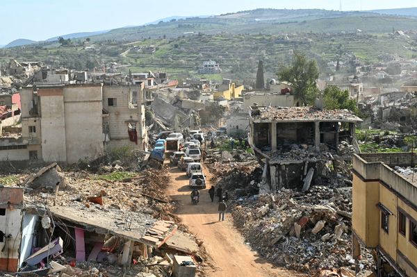
'Our Compass is Broken'—Israel's Ongoing War in South Lebanon
Every day since the beginning of Israel’s war on Gaza in 2023, my father, like many other villagers from Lebanon’s south, has listened to the news in the hope of hearing that he can return to our village along the border of South Lebanon and rebuild our house.
War Across Boundaries–Perspectives on Iran and a Region Under Siege
On February 28, 2026, the United States and Israel launched airstrikes on Iran, initiating a war with wide-ranging consequences for Iran and the broader region and devastating effects for their populations. Already, millions have been displaced and thousands killed. But this war is not a sudden rupture. It is the
Primers

Palestine and Israel—A Primer
This primer provides an overview of key actors, organizations, historic events, political developments and diplomatic initiatives that have shaped the status and fate of Palestinians and the State of Israel from the late nineteenth century to the present. It is divided into topical sections and organized roughly chronologically—although some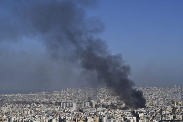

MERIP Updates

MER 318: Campus Politics–Palestine and the New University Order
Dear Friends and Comrades, Today, we published our spring 2026 issue of Middle East Report, “Campus Politics—Palestine and the New University Order.” Its publication comes on the second anniversary of the university encampments, the high point of campus mobilizations against the Gaza genocide that ignited faculty, student and laborThe MERIP Podcast Episode 21: Susann Kassem, Lara Deeb and Habib Battah
Today on the podcast three MERIP contributors discuss Lebanon’s tenuous, one-sided ceasefire with Israel. Even as officials in the Lebanese government have entered into negotiations with Israel, an unprecedented diplomatic move with questionable legal status under Lebanese law, Israel has violated the ceasefire numerous times and has continued its
NEW: Censorship and Surveillance at US Universities
Dear Friends and Comrades, Today we’re publishing the first piece from our forthcoming issue on campus activism and repression since October 7, 2023. In “Censorship and Surveillance at US Universities,” Torin Monahan details the expansive apparatus used by university administrations, often following federal or state political pressures, to police
NEW: ‘Our Compass is Broken’—Israel’s Ongoing War on South Lebanon
Dear Friends and Comrades, Amid the escalating US and Israeli war on Iran, the Israeli invasion of South Lebanon is intensifying. In addition to drone and missile attacks in Beirut, Israel is carrying out a combined ground and aerial campaign aimed at creating a so-called buffer zone up to the
Kicking Off Delco Gives 2026-Support Our Work!
Dear Friends and Comrades, Today marks the beginning of Delco Gives, a fundraising campaign sponsored by the Foundation for Delaware County in which MERIP is participating. While much of MERIP’s work is spread out over the country and the globe, we relocated our base of operations as a 501(The MERIP Podcast Episode 20: The MERIP Roundtable, On the Iran War Part III
Today’s episode is the third installment of our MERIP Roundtable discussing the war on Iran, instigated by the United States and Israel on February 28, 2026, and its regional reverberations. This episode focuses on Israel’s expanded war on Lebanon. Following the assassination of Ali Khamanei, supreme leader of


