Please Explain This Map
In early May the website Vox made a small splash on the Internet with “40 Maps That Explain the Middle East [http://www.vox.com/a/maps-explain-the-middle-east].”

In early May the website Vox made a small splash on the Internet with “40 Maps That Explain the Middle East.”
Vox is perhaps the most prominent of the new sites devoted to “explainer journalism,” a genre of primers that combine key data with brief analysis, often in attention-grabbing, multi-media formats. Vox was co-founded by Melissa Bell and Ezra Klein, late of the Washington Post, and former Slate blogger Matt Yglesias (fun picture here! scroll down), the three of whom lured a posse of young-ish writers to join the staff, including, from the Post, Max Fisher, who compiled the “40 Maps.” The motivation for starting Vox, according to Klein, was to ameliorate the “anxiety” that he imagines readers must feel when approaching major news stories for the first time. “There’s a problem in journalism,” he says in a YouTube promo. “We call certain topics that we cover the vegetables, or the spinach, as if they’re gross, and people should be reading them, but they’re not going to want to.”
“Explainer journalism” has drawn some fire for condescending to its audience, assuming as it does that readers don’t read regular coverage, at least not carefully enough to comprehend the story. As James Hamblin puts it at The Awl, “An explainer is an article that breaks down an important topic into just the things you care about and need to know. It’s unlike all other kinds of articles in that way.”
Other critics complain that the genre is rather insulting to journalists as well, implying that old-school reporters are too lazy, jaded or unskilled to convey what readers need to situate daily news in proper context. Says Democracy’s Nathan Pippenger: “This issue is even more sensitive when it comes to foreign affairs, since many old-fashioned print journalists (like Daniel Pearl and Anthony Shadid) have died in war zones in order to bring what Klein calls ‘vegetable’ stories to American readers.”
These objections notwithstanding, some might think that Vox is doing a service, explaining the background to current events in easily digested bite-size form. (MERIP might not exist, after all, if the corporate media was not often derelict in its duties.) Alas, early offerings with regard to the Middle East suggest otherwise. Yousef Munayyer, for instance, has thoroughly debunked a set of maps that purport to explain the 1948 Arab-Israeli war.
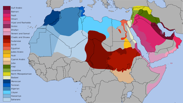
The adjacent map depicting the geographic distribution of Arabic dialects is equally misleading to the point of misinformation. This map, which seems to have been compiled (or perhaps just lifted) from Wikipedia, is downright inaccurate in several places.
Chris Stone is associate professor of Arabic at Hunter College. Before he began his doctoral work, he lived in Yemen for three years, teaching English in the Peace Corps. It would be bad enough, he says, “if the map claimed just one dialect for Yemen, but to claim that all of Yemen and coastal Somalia speak the same dialect is patently absurd.” Yemeni dialects differ in pronunciation, cadence, vocabulary, idiom and syntax -- not to the point of being mutually unintelligible but certainly to the point of requiring occasional translation. The dialects spoken in northern Egypt and the areas marked olive green for Levantine likewise vary considerably, sometimes from valley to valley and village to village.
In Sudan and South Sudan, respectively, the map identifies Nubi Arabic in orange and Juba Arabic in deep beige. The first reference is a flat-out mistake: Some of the Nilotic peoples in the north of Sudan identify as Nubians, and they may speak the distinct language called Nubian as well as an Arabic similar to that spoken in Khartoum. Nubi is an Arabic-based creole spoken in a few East African port towns. Meanwhile, according to MER editor Khalid Medani, who is from Sudan, there’s a missing dialect -- Nuba Arabic, “a creole spoken in the Nuba Mountains in central Sudan. It is a mix of Arabic and Nuba not Nubian. Folks often get those two confused.” Juba Arabic is also a creole, Medani continues, “spoken by the Nilotic Dinka, Nuer and Shilluk, especially in Juba where it is the second vernacular.” The Dinka, Nuer and Shilluk are not Arabs, by the way -- more on that in a minute.
Surely the oddest error of fact appears in mustard yellow for Judeo-Arabic, which the map locates (solely) in central Israel. Indeed, linguists do speak of such a thing as spoken Judeo-Arabic, in which Arab Jews sprinkle ancient Hebrew and Aramaic terms. Judeo-Arabic, however, normally refers to a written language, namely, classical Arabic written in Hebrew script. More to the point, while there were small communities of Arabic-speaking Jews in Palestine before the creation of the state of Israel, the large majority of Israeli Jews of Arab origin hail from other Arab countries and, if they still speak Arabic, they speak the dialect of those countries. “Jews from Morocco, Iraq and Yemen speak the same Arabic dialect?” Stone queries. “I smell ideology.” (Incompetence seems just as likely, since all of the information in this paragraph is in the Wikipedia entry for “Judeo-Arabic languages.” Maybe that entry needs an “explainer.” Or maybe the title does, since the plural is right there in the third word.)
We could list some more inaccuracies.
A bigger problem with the map is that the uninitiated Vox reader might think that Arabic is the only or most important language spoken across these swathes of bright color. Berbers in blue North Africa would beg to differ, as would Kurds in the greenish-yellow lands of North Mesopotamian Arabic, Armenians in Lebanon and several other religio-ethnic communities, among them Hebrew-speaking Israeli Jews. And the Dinka, Nuer and Shilluk speak their own languages as the first vernacular, thank you very much.
The map’s cardinal sin, however, appears in the explanatory sidebar: “Something to look at here: where the dialects do and do not line up with present-day political borders. In places where they don’t line up, you’re seeing national borders that are less likely to line up with actual communities, and in some cases more likely to create problems.” In other words, Arabs are fighting other Arabs because of differences in dialect.
Sorry, Vox, this notion is cataclysmically wrong. Leave aside the map’s implication that the conflict in Israel-Palestine is about the fact that Palestinian Arabs in the Galilee speak a different variety of their native tongue than the Judeo-Arabic speakers to their south. Forget the idea that the Syrian civil war might be a clash of North Mesopotamian, Iraqi and Levantine dialects. And don’t ask why civil strife continues to afflict central Iraq despite its uniform dark green dialectical hue. Again, we’ll be charitable: Smart and patient Vox readers can refer to other maps in Fisher’s series and figure this stuff out for themselves.
But there are some other places where dialects do not line up with borders on the map and there is sometimes violent conflict. One is the boundary between Morocco and Western Sahara. Nowhere in the “40 Maps” is there any clue as to the roots of this conflict in Spanish colonialism, the expansiveness of Moroccan territorial claims, the 1975 Green March, Sahrawi nationalism, the Moroccan Arab-Berber settlement of Western Sahara in violation of UN resolutions, the UN’s failure to enforce those resolutions, and French and US coddling of their client state in Rabat. Iron-deficient Vox readers are left to surmise that the conflict is about types of Arabic.
As for the two Sudans, indeed, the border between the state controlled by Khartoum and South Sudan, which became independent in 2011, roughly corresponds to the boundary line indicating where different sorts of Arabic are spoken. But to suggest that the long civil war between north and south, or the decision of South Sudanese to secede, has to do with dialectical distinctions is to enter the realm of the ridiculous. South Sudanese developed their Juba Arabic creole to cope with their northern rulers and do business with the northern merchants who set up shop in southern cities. Differences in dialect were a byproduct of conquest and conflict -- not the cause thereof.
Again, we could go on. But why?
The kicker, as Stone says, is the map’s assumption of an “inverse relationship between linguistic unity and ‘problems.’ Have the authors of the map not heard of India, where we are not only talking about a vast number of dialects, but actually different languages? What about Switzerland?” In the end, this map reinforces the old Orientalist saws that Middle East conflict is understandable chiefly in terms of ethnic identity and that primordial ties are uniquely constitutive of politics (and certainly not the other way around).

If we can muster the energy, we may scrutinize a few more of the “40 Maps,” cursory inspection of which reveals more amazing feats of interpretive malpractice. Probably not, though -- we should stay focused on our own efforts to go behind the headlines.
We do, however, have a question for Vox: What good is “explainer journalism” if one fortieth of one piece requires 1,068 words of third-party explanation to correct just a few of its errors, without yet rendering it legible? (We’re not counting the words spent explaining explainers, or our editorializing here, just the “spinach” about the map itself.)
Please explain.

